Raw observations
Daily scale weight and logged sets never disappear behind the smoothed line.
Graph views, not gamification
Charts answer a training question: Is the weight trend moving? Is maintenance converging? Did volume jump? Is the lift progressing? No rings, streaks, or scores without a decision attached.
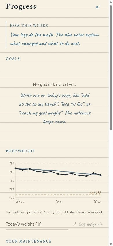
Chart rules
Daily scale weight and logged sets never disappear behind the smoothed line.
A pencil-blue trend reduces noise only for the decision the chart is meant to support.
Brass marks a declared goal, prescribed range, or current target—not a universal ideal.
Measured maintenance shows confidence and links back to the complete food days and weight trend that produced it.
Questions the graphs answer
Early access on iOS
Flexbound keeps the observation, trend, reference, and explanation together on the same notebook page.